Abstract Expressions: Unveiling the Colourful World of Katherine Bernhardt
Ahead of her upcoming exhibition at David Zwirner in Hong Kong, Katherine Bernhardt speaks with Modern Matter about her creative process and the sensorial power of colour.
Known for her vibrant paintings and wry visual lexicon, Bernhardt turns her attention to characters from the Japanese media franchise Pokémon. For this continuous series, she draws on the aesthetics and pop-art sensibility of individual playing cards, transforming the bold graphics and playful iconography.
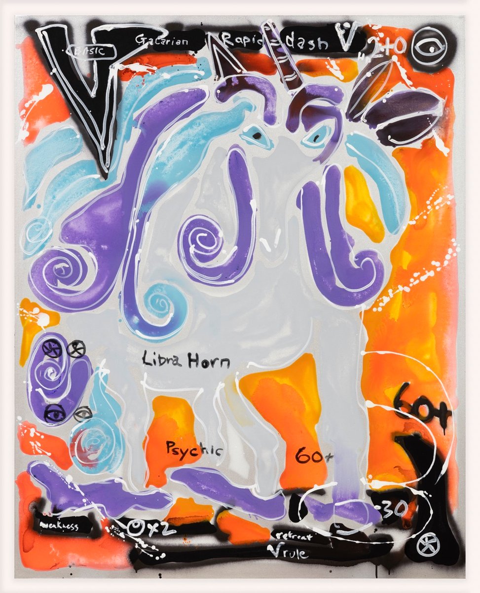
Galarian Rapid Dash, 2023
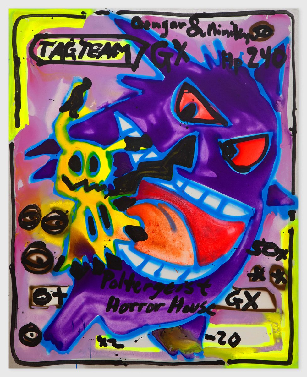
Gengar and Mimikyu Tag Team GX Poltergeist Horror House, 2021
Modern Matter:
Can you talk a bit about your process for creating a new piece of art, from conception to completion? How do you know when a work is finished?
Katherine Bernhardt:
I like to outline my paintings with spray paints, and I use a variety of colours for the initial lines including fluorescent pink, green, yellow, orange, blue or black or whatever. It’s a way to map out the space, and I often like to see that while standing up. Meanwhile I have hundreds of colours mixed in hundreds of containers on some nearby tables. Making good nuanced colours is one of the keys to any interesting painting— so I have colours handy. Then I fill in the outlined shapes. I use a lot of splashy watery colours and so some of the colours help make the painting themselves by pooling together in new and unpredictable ways. Runny paint will settle if the canvas is lying flat on the floor; the paint will do its own thing and help create new colours and designs all on its own. It’s fascinating to watch that happen and see the results as the painting works on itself and completes itself. Finally after the painting is pretty dry I might add some details with a big fat paintbrush.
MM:
Your work has been exhibited in galleries and museums around the world. Can you share with us one of your favourite exhibition experiences and what made it so memorable for you?
KB:
I love all of my shows but one of the best was in Switzerland in 2018 at ART BASEL UNLIMITED. For that show I created a giant painting in my rather big studio in Brooklyn. It was pretty gigantic (2128cm x 305cm) though so I had to make it in multiple parts that were divided into sections. And then when I stretched out all of the individual paintings in a row to make it come together as one, it ran exactly from the front door of my studio to the back door. The name of the painting was ‘Blue Skies’. Each section had a different coloured background that moved across the canvases in what appeared to be a mega kind of fade. It went from black to dark blue to light blue to neon green to turquoise; and superimposed on those individual blocks of canvas appeared many objects from my then-current repertoire: avocados, toucans, bananas, bumblebees, Coca-Cola, watermelon slices, cigarettes, R2D2, and lots of other colourful subject matter. It was one of my favourite paintings, and it took up a whole wall at Art Basel Unlimited–and the walls there are extra large so it felt awesome and satisfying to have done that colossal piece of work.
MM:
Your work often incorporates elements of street art and graffiti. Can you discuss how these influences have impacted your artistic practice, and how you balance their spontaneity with the more deliberate process of painting?
KB:
I love art and I love painting, and I am more attracted to what is considered fine art rather than street art. I also love stain painting and symbols. I find the use of colour in the work of Morris Lewis and Helen Frankenthaler to be fascinating–and this is how I see my own context too. I don’t look to graffiti as a source of inspiration even though I do like seeing posters all around NY that have been put up with wheat paste on abandoned buildings or any available walls.
The use of a spray paint can by an artist doesn’t mean that the painter has created a work of graffiti. That said, many years ago when I was walking around Union Square, I came across a makeshift boarded up wall that had something that could be called graffiti on it. And this graffiti was made of a heart, a smiley face, a dollar sign, a rainbow, and some other symbols that I can’t remember right now. And after I saw those designs on that white background, it got me thinking a lot about symbolism. And at that time in my life I was also spending lots of time in Morocco where patterns abound on rugs, and the symbolism woven into those rugs that had to do with life and nature struck me. And so I started collecting many of those fascinating patterned rugs as works of art. I have also always enjoyed patterns on gift wrap. And over the past decade or so I have watched and reflected on our use of emojis in daily communication; we have boiled down our thoughts into symbols, and if we have to, we are even able to reduce these thoughts and our communicative skills into fun colourful emojis. Communication in our day and age can even be entirely based on these fun artistic symbols, and it’s a fascinating concept in and of itself to be able to use them individually or in groupings for so many of our ideas and emotions.
So, in those ways and from those items I became fascinated with the idea of painting symbols and patterns: from graffiti symbolism on a wall near Union Square, from carpet designs made by Moroccan women and seen in the souks in Marrakesh, from a huge collection of 80s and 90s wrapping papers in my parents’ basement, and from our usage of iPhone emojis-all mixed together-is what got me into pattern paintings. My work is further based on other symbols and objects that I love including Guatemalan embroidery, beautiful birds in nature, Tamayo’s watermelon paintings, huge pink Barragan walls in Mexico, and the love of Monet’s garden and his paintings of it.
MM:
You’ve mentioned before that you’re drawn to the energy and chaos of cities. How does your urban environment inspire your work, and how do you capture that energy in your paintings?
KB:
I love New York. And I identify as a “lifer” even if I’m not currently based there. After having travelled a lot and visited some megacities around the world, I have come to realise that New York can seem like a small town. I love watching the people on the streets and on the subway. I love walking around and looking at everything, I love the overstimulation of it, I love the energy of it, and I love the historic and run down nature of a lot of parts of it. I like seeing wheat-pasted signs on walls all over the place. I like looking at the graffiti there too. I love going to all of the art shows and meeting people from around the world. So yes, my work has a lot to do with the energy level of NY as a city. And I capture that energy first thing in the morning in my studio here in St. Louis. I go there, and I paint. I don’t work out so I let out all of my physical and mental energy and anxiety into my art. My energy is channeled into the painting. Paintings have energy, and that’s how I put my energy into them.
MM:
You’ve worked with a number of different subjects, including food, animals, and everyday objects. How do you choose what to paint, and what draws you to these particular subjects?
KB:
Visual motifs pop into my mind for different reasons. I look at and consider a variety of material things all day long: magazines, Instagram, real life, books, store fronts, exhibits, advertisements, signage, nature, landscapes, people’s faces, other people’s art in galleries and museums, etc. Some things attract me because they are funny. Other things attract me due to their colours or shapes and forms. And some things attract me because they remind me of my childhood and of my early life back in the 1980s. So in my mind there is a repertoire of icons that usually form the core of my work. Then after choosing some core object(s) for a painting, by looking at the positive and negative shapes left on the canvas after the core things go in, open spaces remain, spaces where other objects and shapes can fit together into the remaining areas. So it’s kind of like puzzle pieces fitting together. (For example, if a triangular shape remains in the corner of a painting, a painted Dorito might fit in perfectly; or if the shape is more square, perhaps a the design of a thick roll of toilet paper could go there.) That is how my paintings are put together.
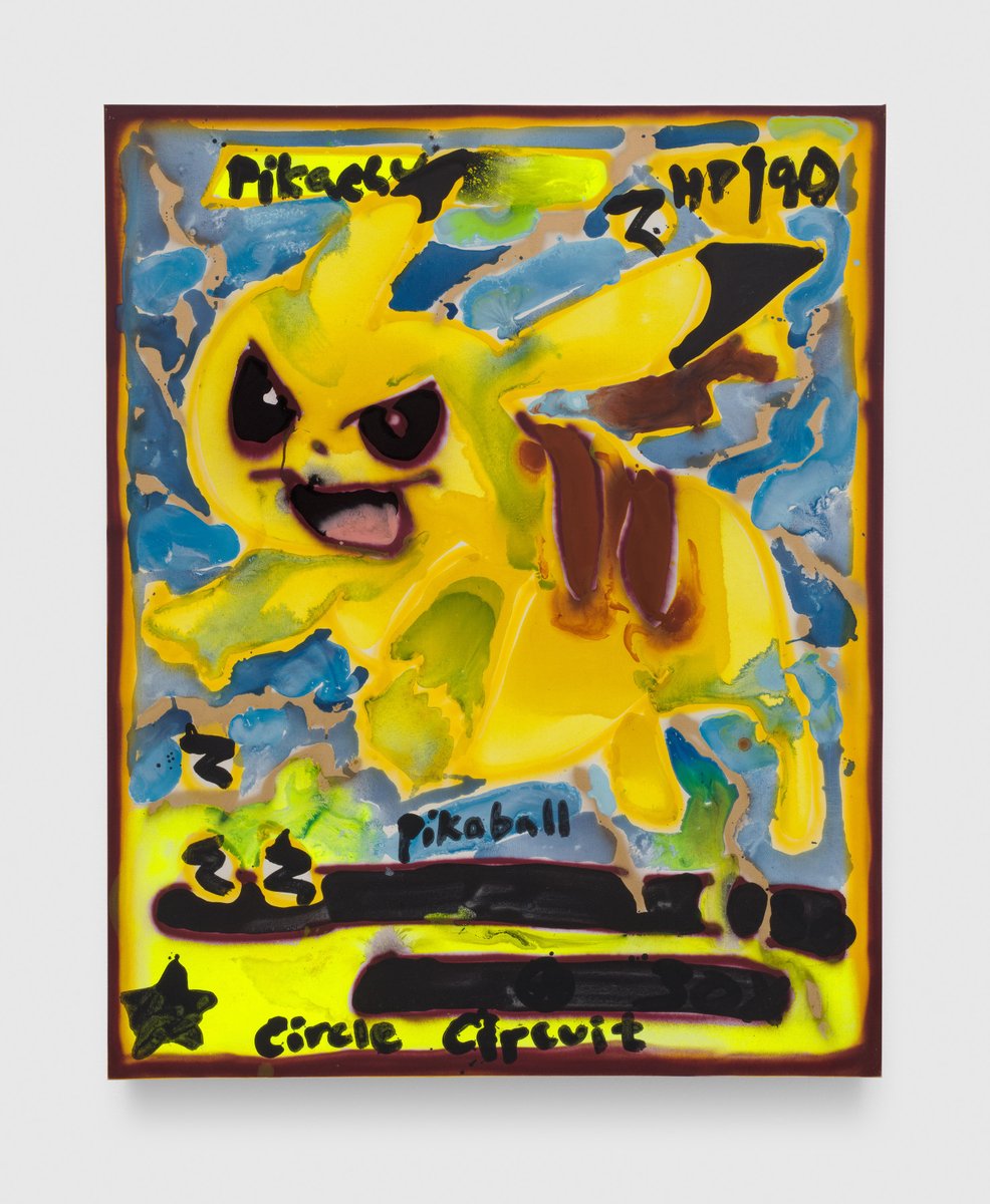
Pikachu Pikaball, 2021
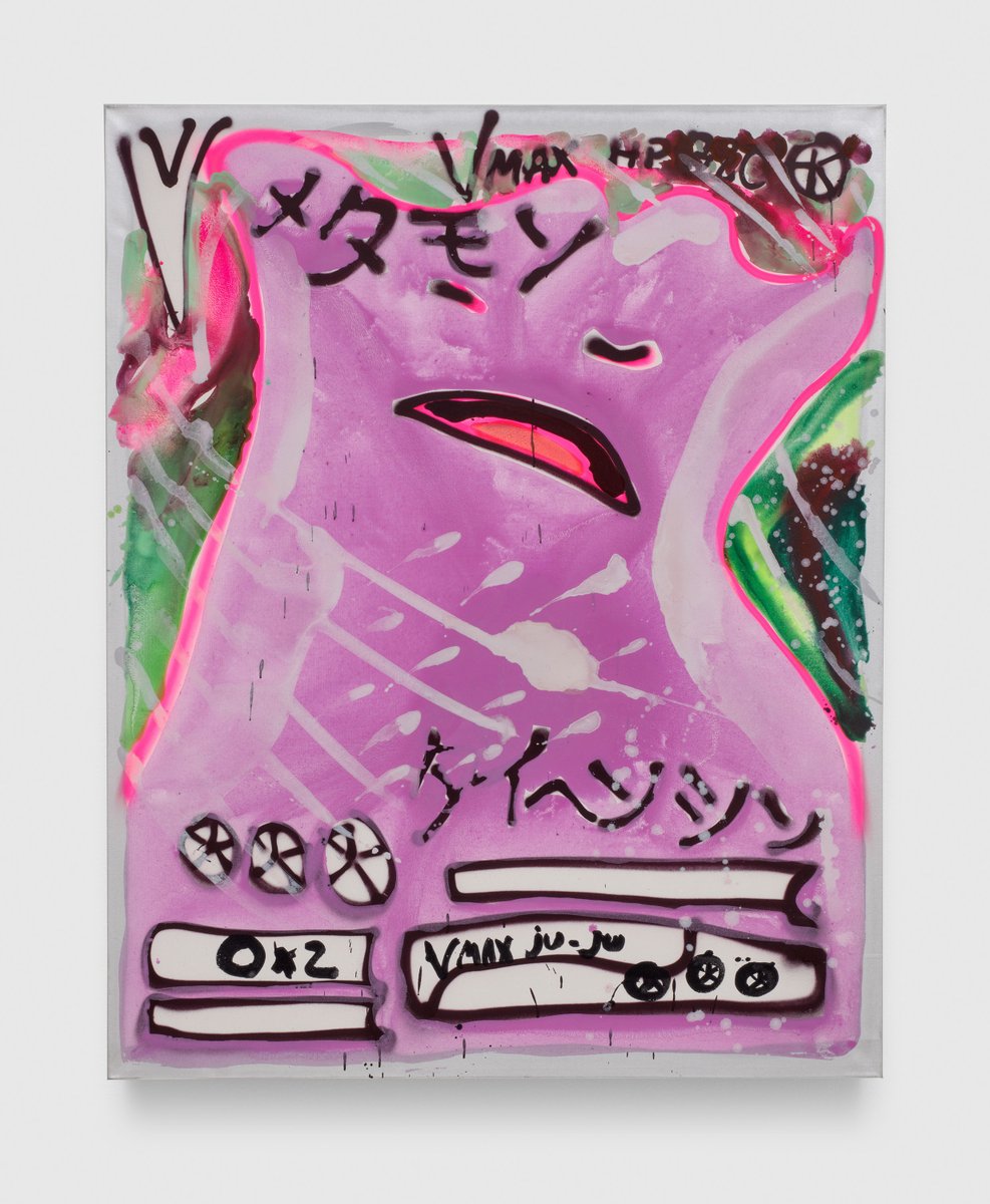
Ditto VMax Ju Ju, 2021
MM:
Looking ahead to your upcoming exhibition at David Zwirner in Hong Kong,what can viewers expect to see, and how does this show fit into the broader trajectory of your artistic career?
KB:
In the past I have tended to paint pop characters (e.g. E.T., Garfield, the Pink Panther, Bart Simpson or what have you) as part of or even as the basis of patterned compositions that often included other miscellaneous objects based on their shapes, slogans and colours. But this time for this particular show I have instead focused intensely on Pokémon as a card set. Each individual Pokémon card is an amazing sample of twenty-first century pop art in and of itself; it is a full composition that includes one character plus numbers and words often written in Japanese script, intense colour combinations, lines that refer to movement, depictions of fire and other cultural details. Pokémon was originally based on insect designs from nature and was originally called Pocket Monsters. A series of these insect designs evolved into a card set called Pokémon, and I got very close to these cards since my son and his friends collected them in big folders and traded them for fun. So I started to make paintings based on some of the characters from individual cards. It was always important to keep in mind that each individual card is also part of a large stack of highly-collectible cards that you can use to play a game (or just collect for fun).
In my show the characters appear individually on singular canvases but each one is also just one face of a large group set. And all of the paintings are the same size, like a deck of cards would be. There are over 1000 different Pokémon cards in existence so there’s a lot to choose from as a painter and admirer of them. I like to paint things that are infinite, things that have no end, or combinations and patterns of things that can be painted infinitely; for this reason the Pokémon collection as a subject fits perfectly into my process of finding a never-ending subject matter for the creation of art.
MM:
You often draw inspiration from your travels, particularly to places like Morocco and Thailand. Have any recent travels influenced your recent work?
KB:
Four years ago I went to Brasilia, the capital city of Brazil, an environment that serves as a showcase for the incredible experimental concrete architecture created by Oscar Niemeyer. Experiencing his gigantic sculptured architecture felt like being in another world—it literally felt like visiting a futuristic city in outer space. The architecture is like nothing else on our planet. It defies descriptions. It is simply awesome. Another intense travel experience comes to mind: sleeping in what looked like an ancient bed (hand-crafted out of hay, mud and wood) in a hut next to an erupting volcano in Ecuador. It made me feel immediately connected and conscientiously in touch with the core of our planet and our existence on Earth since the beginning of time.Asia is vast, and I have only seen a little bit of it. But so far I have truly loved the Naoshima art island with the houses made of burnt black wood in Honmura and the art dispersed outside and around and inside the Tadao Ando buildings. I loved how there is only art on that island and nothing commercial, it’s an environment for an idealist. I loved seeing a Monet show there that was curated in a space-age kind of environment underground. His works looked incredible and surreal in such a context.
MM:
Some of your recent work has explored the concept of ‘flow’ or ‘stream of consciousness.’ How does this concept manifest in your painting practice?
KB:
I am an artist so I react to things and make things. I am not consciously trying to comment on contemporary society in my work – that’s something for philosophers, scholars or academic art historians. It’s my job to paint and focus on colours and forms, not to make commentary. I am attracted to consumer culture based on its shapes and colours mostly. A lot of contemporary cultural icons have good marketing campaigns: some of them attract me and draw me into their aesthetic worlds, and I can then get stuck on them as a painter.
I am a product of and reaction to my environments and experiences!
MM:
In past interviews, you’ve discussed your interest in bright colours and clashing combinations. Can you discuss how you choose your colour palettes?
KB:
Every colour recalls a stream of feelings and associations for every individual person based on our own individual life levels; so colour is something that goes way beyond generic colour theories that affect our moods and feelings. I tend to like pink, and shades of pinks and lavenders are some of my favourite colours. I painted the back of my new house in a couple of different shades of pink, I wear a lot of pink t-shirts, I planted a lot of cherry blossoms in my backyard that are currently pink, I always wear the same shade of matte pink lipstick, I am drawn to the Pink Panther probably because of its pinkness, and I like to paint the Pokémon Ditto because Ditto is a pink slob who morphs into different pink shapes. Pink is a warm and fun color for me. Some people think pink is sweet, charming and related to baby girls – but anyone can interpret and use pink (or green or white or black or lavender or whatever) in their own way. For example my son wore hot pink socks to a soccer game last year, and a teammate yelled out: “Tough guys wear pink!” So pink can work for anyone.
MM:
You’ve been praised for defying rules in your art. Can you talk about how you break with convention and what kind of freedom this allows you in your work?
KB:
So, I work with paint, a paintbrush and canvas – it’s actually all pretty incredibly traditional when you think about, and it’s not radical at all on the most basic level. It’s a form of art that came out of late Renaissance-era Venice, and it’s a practical way to make a painting, and it’s since been popularised around the world for the past 500 years or so for many reasons. It does break with convention though with regard to content. My freedom consist of painting whatever I want. Being able to paint whatever I want, including things that maybe hadn’t been considered serious or worthy of a painting before. Painting anything whatsoever is where my freedom lies.